
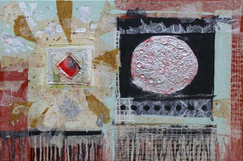
Carey Crane, After Jim, December, 2016 36 X 24″
How to begin? Having taken a long break from Art-Making, where to start in again? I asked Jim Crane (Dad) this question some time ago. He would work intensely and prolifically for stretches before he was once again caught up in the life of a dedicated professor and art department administrator at Florida Presbyterian, later Eckerd College in St. Petersburg, Florida.
“I came to Florida with a raise in salary. But mainly, I thought it was a terribly exciting school with all sorts of possibilities, and I felt also I would have more time to paint, that part of it was not true.”
Teaching, and the Florida Presbyterian/Eckerd community became his passion. But still, he made a lot of wonderful art.
Dad talked about periods of making art as “emptying out” and the interim periods as “filling up.”

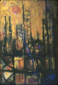
Jim Crane, circa 1967
Painting/Collage: Defining a Period
How to begin? I propose to draw from a period of time in my father’s artwork defined by childhood memory – work created in St. Petersburg, Florida between 1963 and 1968. consider this the height of his Painting/Collage period, initiated a few years earlier by a dropped jar of Cadmium Red paint.
*A Jim Crane painting before the “Cadmium Red Scare”
Jim Crane: Oh yeah. That is a story I like to tell. I was painting in the graduate students studio [Michigan State] and I dropped a jar of cadmium red paint…which is fantastically expensive, cause I didn’t have a lot of money. I probably said a few cuss words under my breath and started tearing out papers from the big can of newsprint I had and wiping the stuff up. When I unfolded the paper, I found it was more interesting to me than what I was working on. So I borrowed some automobile lacquer from Ken Wynsma – that is what he was using, and glued the paper to the painting. I really found it pretty interesting. It so happens that I was studying with Murray Jones at the time and Murray Jones had just come back from Japan and he was doing absolutely lovely paintings…or not paintings–collages with Japanese paper. So I bought some Japanese paper, and I started doing collages too, although with paint in them. Murray was worried about me because he was afraid that he had over-influenced me and he called me in and talked to me. He looked at what I had done. And he said, “No, actually you’re combining collage and painting, and what I am doing is purely collage.”
Murray Jones, Nara I, 1960. web sourced
Circles, Squares, Veils, and Drips – A Vocabulary
Carey: You talked . . . about the circle and the square. I think, the circle being eternal…
Jim: The circle being a kind of symbol of nature and the eternal, like the moon is circular and all sorts of things are circular. But the square is measured on each side. That’s kind of interesting because if you compare the collages, they are all on a square. And they contain squares except they contain circles too, but there is some kind of tension between the circle and the square. Back to the collages, I had talked earlier about. [Josef] Albers and . . . other people have used squares, and they were very “pure” squares. My squares break… they had torn edges, messed up surfaces sort of like the rationale was having a really hard time surviving in the world where there were things happening to it all the time. My squares did not live in the . . . world of the Albers square because my squares, some of them, they were tortured, painful . . . .
Note that the circle (sun) and square are often used in Jim Crane’s earlier work. * above.
You will also note “veils” in a lot of my father’s work from this time. Veils are full sheets of paper made translucent by thinned acrylic medium adhesive, folded back upon themselves to create textures and linear rays of variegated opacity. To know a veil: The use of veils is clearly influenced by Murray Jones (photo above).

Jim Crane, 48 x 48″
Process
Though Dad was supremely articulate about art, creating his artwork was not primarily an intellectual pursuit. He was of-his-time in taking a “process-oriented” approach to creating collage/paintings. His aim was not to realize a methodically conceived and carefully planned outcome. The process of creation was a “conversation” with the piece; one thing leads to another. In musical terms, he didn’t play from a score, but started with a familiar melody (vocabulary, materials, color palette) , then improvised his way towards a resolution.
He would usually work the collage elements with the panel “flat” – face up on the floor or low saw horses. That is often the best way to collage when using thinned medium, or to capture “flooding” – pooling washes of paint. There are many incidents of Expressionist style dripping in his work. My guess if that these drips were a stylistic device as often as incidental to the process. Naturally the panels would be tipped up to achieve this effect. I don’t recall him making use of his easel. Working in Florida allowed painting outside on the studio deck throughout much of the year.

Materials
Masonite panels. Masonite, or heat and pressure formed wood pulp composite panels, were and are readily available in 48 x 96″ sheets. Dad’s larger works employed this dimension ready-made. More typically, he would have the panels cut in half to 48 x 48″ squares, or those halves quartered into 24 x 24″ squares. I know that he had gallon jars of acrylic gesso around for priming panels, but suspect that he worked directly on the panels, using thinned acrylic mediums and paints to seal the masonite. His discovery of acrylic polymer mediums as collage adhesives was very fortunate:
Jim: Incidentally, Murray had taught Ken and other people how to use automobile lacquer as a clear lacquer surface that they could use to glue stuff down. The lacquer thinner is absolutely toxic. It will get into your skin and in your lungs, and so that is what happened. Murray got a better job and moved to Ohio State University, but died from his use of the lacquer thinner. [?]
Dad used acrylic paints nearly exclusively after the late 1950s. As for collage materials, he used newspaper and magazines early on, but mostly employed Japanese rice paper and shear fabrics – materials as materials without reference to a previous history or use. He would include small “found objects” on occasion, such as flattened bottle caps and pop-tops.

Jim Crane, 24 x 24″
I believe that he picked up the paper and had the masonite panels cradled (backed with 1 x 2″ wood supports) and framed in a little shop over the bay in Tampa. That meant that I could occasionally accompany him with the promise of a Cubano and Garbanzo soup at the Columbia Restaurant in Ybor City.
In the Manner of Jim Crane: Similarity and Divergence
As I work “in the manner of” Jim Crane, no one is likely to confuse our efforts; once started, I take an improvisational approach as he did. For each painting/collage in this new “Jim” series, I have looked at one of his pieces and held it in my mind as a starting point, I did not continue to view that image as I worked. My own “conversation” with the piece in progress took over, followed to resolution. How do I know when a painting/collage is “done?” Much as one senses when a conversation with a friend is concluded, or a prized collection is agreeably displayed.
I have many thoughts on the convergence and divergence of Dad’s work and mine, but I’ve kept you long enough. In conclusion, I will simply post one on my new collage/paintings and the Jim Crane that initially inspired it.

Jim Crane, “Chrysalis” 24 x 24″

Carey Crane, after Jim, December, 2016. 24 x 36″
For more images of Jim Cranes 1960s work, look here: https://wordpress.com/page/jimcraneart.com/73

Carey, this is beautifully done, in every aspect. I am sure this is true. I knew everyone mentioned and their artwork. I am thrilled to see how you learned so much about Jim by hanging around the studio and asking questions and finding your own approach through the years.
Mom
Thanks for this post Carey, it’s so full and open I can only digest portions so as to not gorge. Love a post that demands a re-read, and another. The light and translucency in your dad’s work is beautiful. And your December pieces are melodies harmonised.