
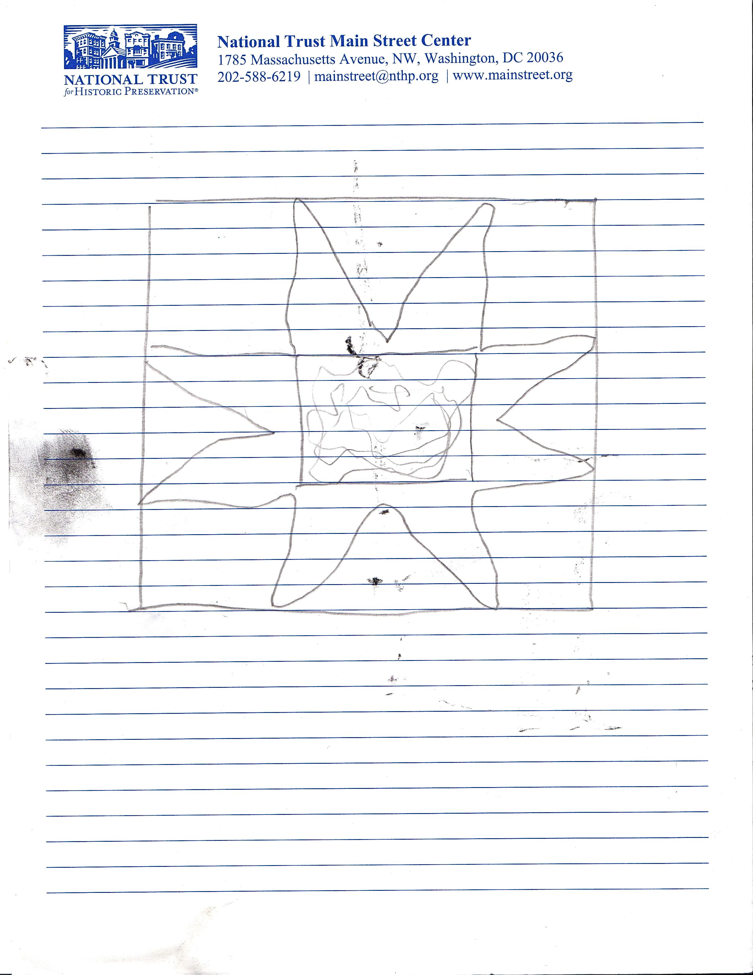
Catherine B. suggested “Some kind of demonstration” for Saturday’s gallery talk. It’s best for me to document a work as it progresses. My process varies work to work, but I generally start holding a “drawing” or schematic in my mind. I jotted this one down based loosely on a previous piece:
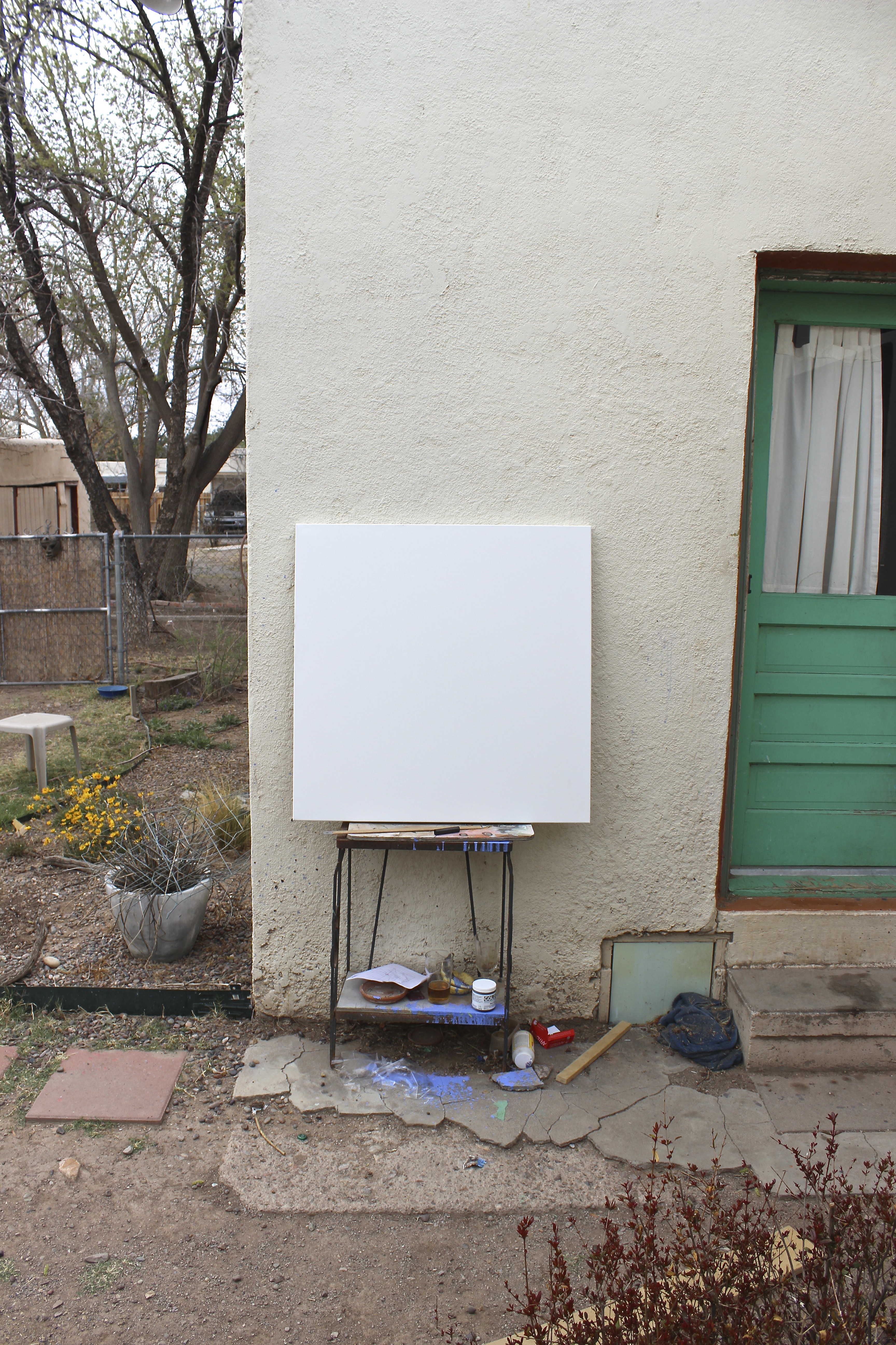
The Void. I usually stretch my own and play off of the raw canvas and uneven brushy gesso. This commercial stretched-and-gessoed canvas was very reasonably priced at a new store on Main Street. Thus, I supported the locals, and it helps to get on with it. First lesson of painting — “Don’t fear the canvas.” This piece was entirely created in “Studio One” (the back yard) as seen in the background:
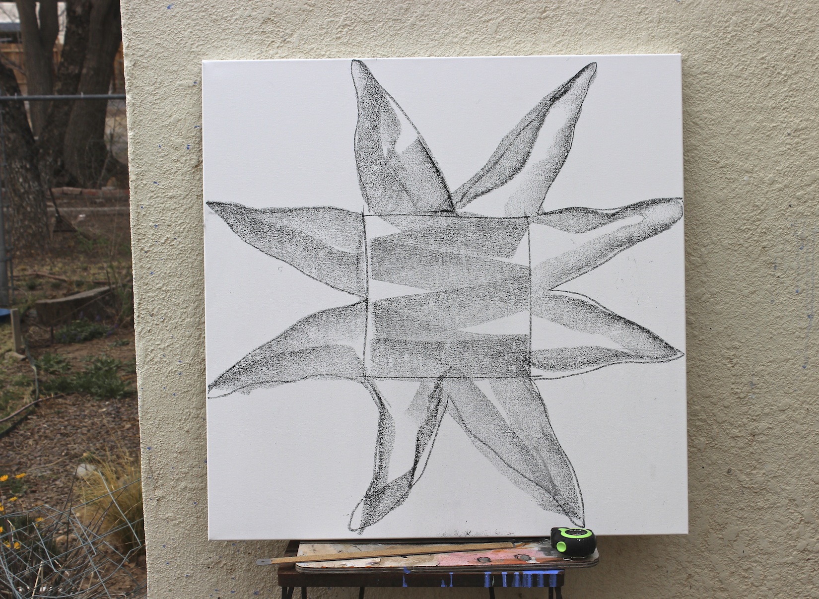
Sometimes I’ll draw in with charcoal as did the inestimable painter/professor Hiram Williams. I used a charcoal stick as round as my thumb. Already deviating from that simple sketch:
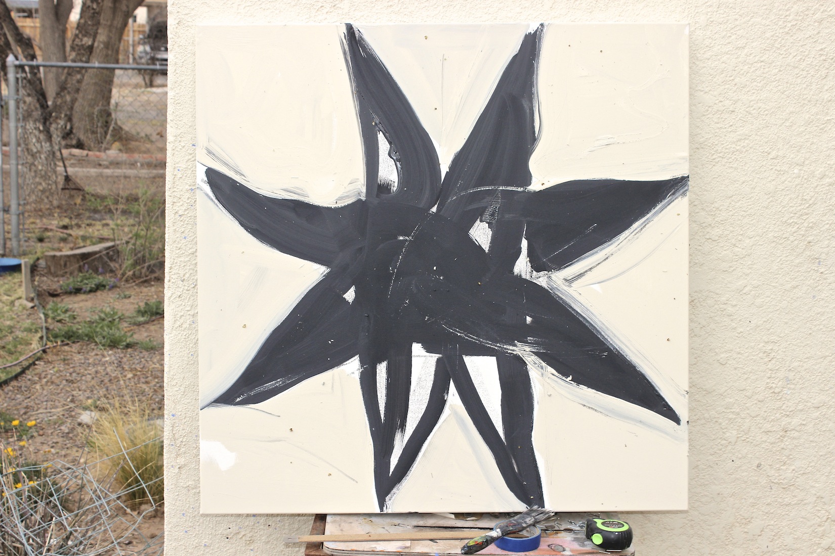
Then, painting in the form with a “cracked peppercorn” grey. Might have left more of the drawing texture. . . It is hard to see, but I toned the ground for a little warmth. Note that it is still a little early in the day:
Here comes the sun. Watch those shadows as the work progresses. There is enough variation in surfaces in this one that I was able to work almost continuously while adjacent areas dried. Note the “Martha Living” Textured Metallic ® medium. Not used as Martha intended, but great stuff exclusive to The Home Depot ®.
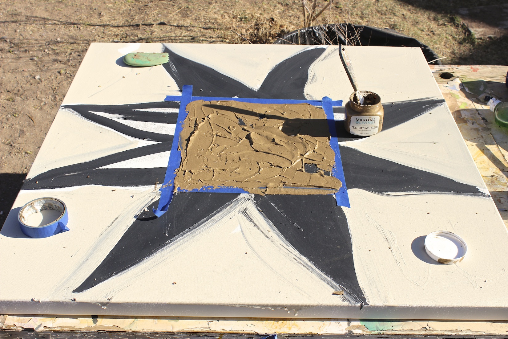
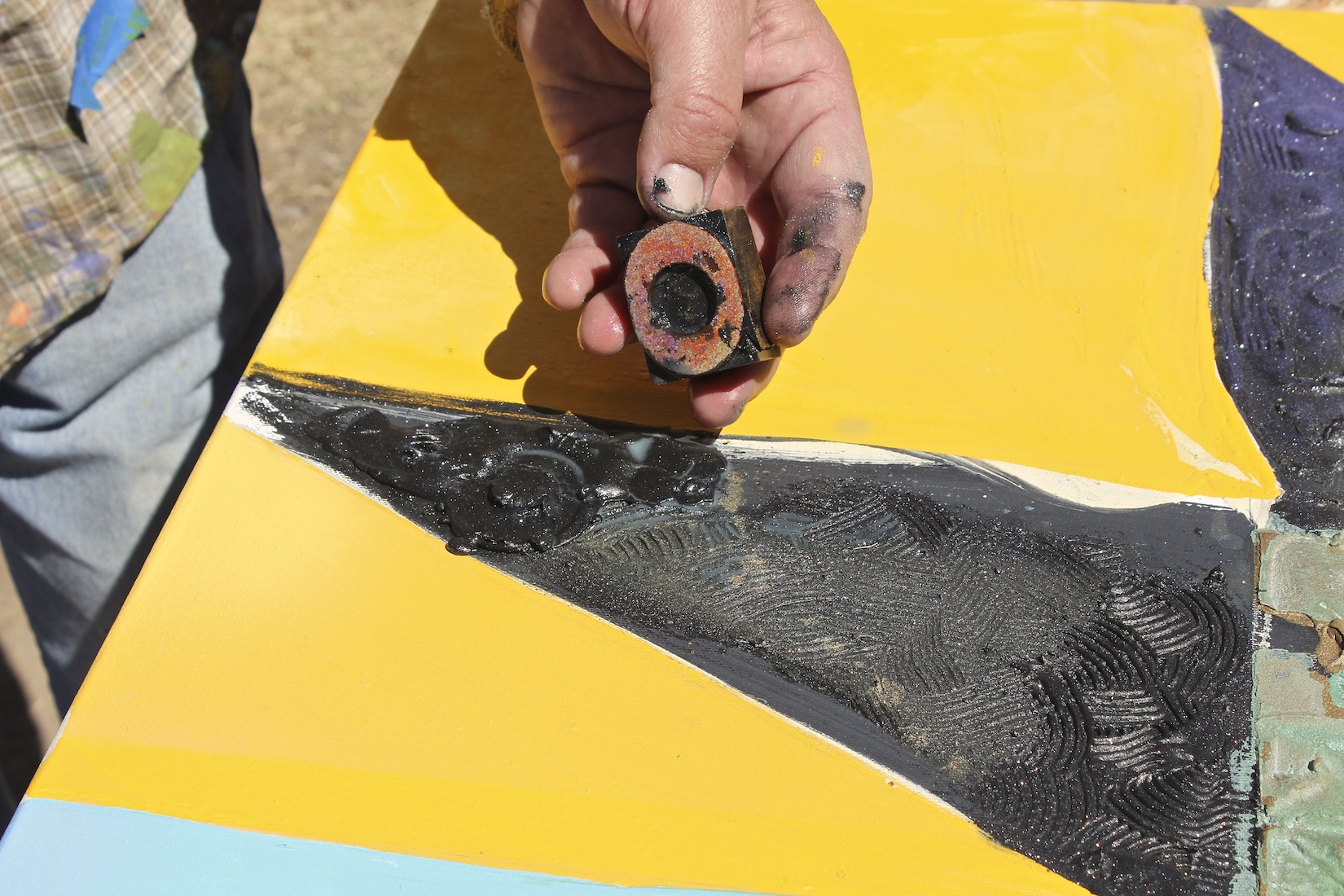
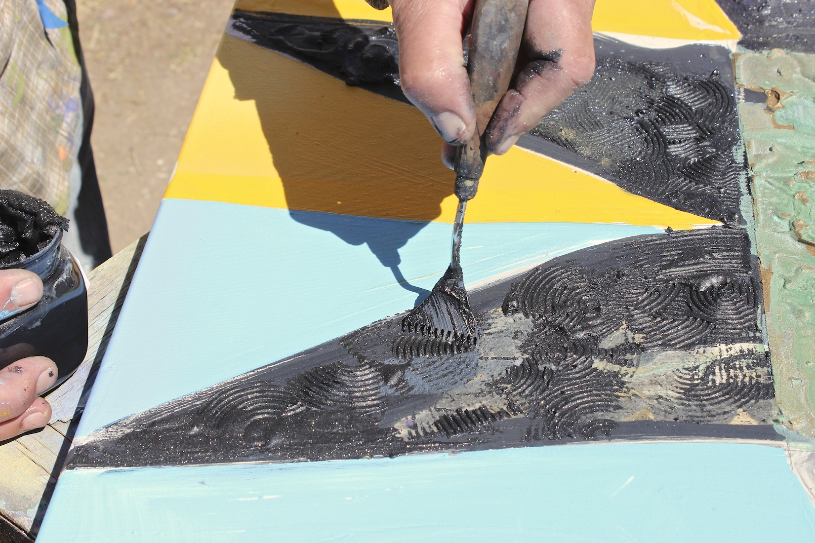
Martha Living smeared out unevenly with a pallet knife. Note same line of product in the lower Tentacle/Ray in black w/sparkles:
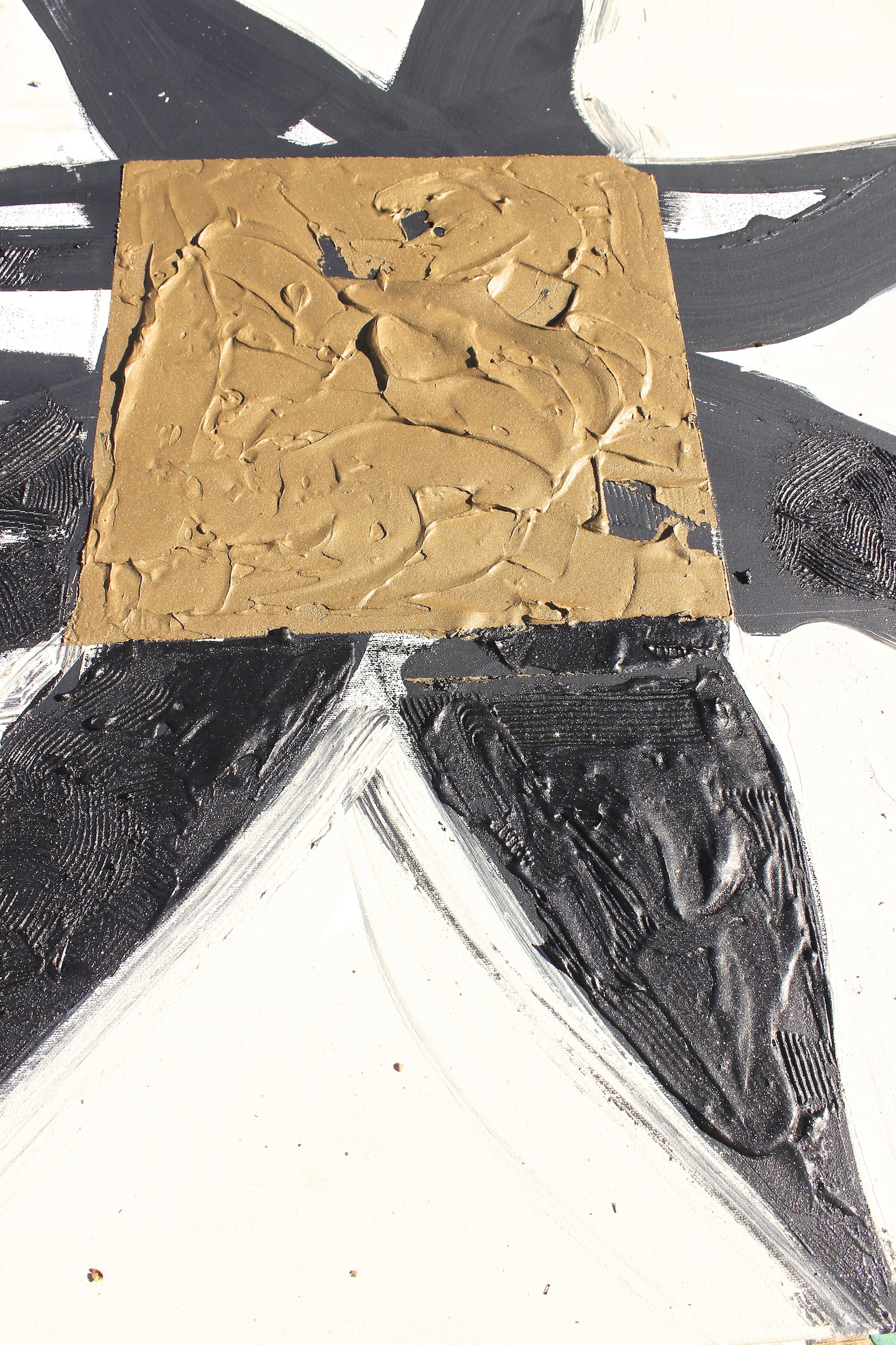
Pressing textures:
Color added (or for Aussie friends “Colour.”) Pretty straight up, so jumping ahead. I did add white to the pigments.
You will see the texture/pressing further down:
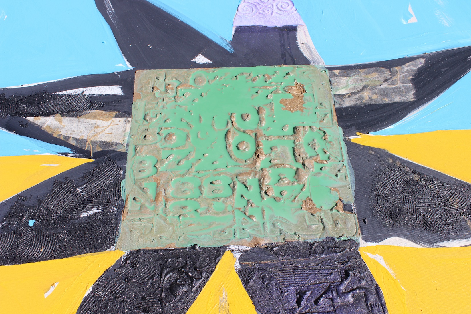
Flooding the textured center area with a wash of color. Love verdigris – an influence from the “real world.” You can see first-stage collage creeping in. The natural mango paper on the left is transparent when applied with the right viscosity of acrylic medium. There is a little vestigial charcoal peeking through. The paper also tones back the white of the gesso:
Below is a stage shot with the flooding dry:
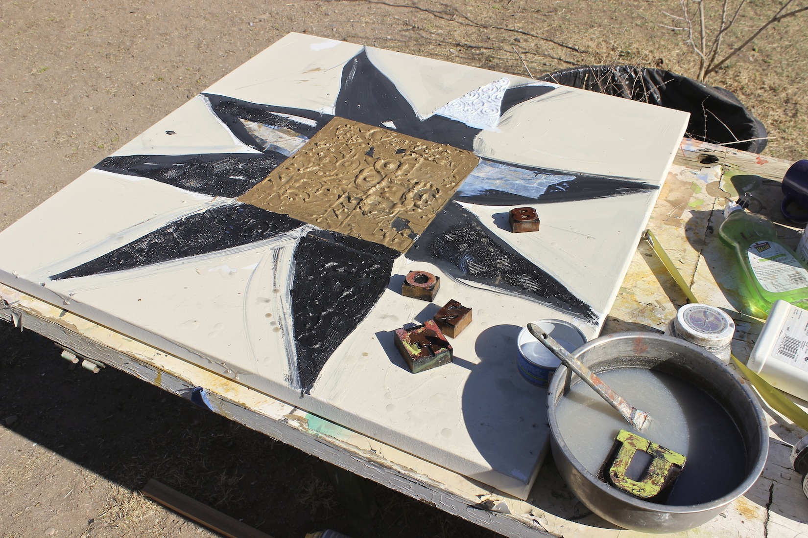
Stamping. Many years ago, I found some wood printing press letters in a little shop in Micanopy, Florida. I’ve started using them to make an impression on Martha. Proprietary secret: allow the metallic medium to skin over. Dip the letter or other impressive device into water so that it wont stick.
Mas:
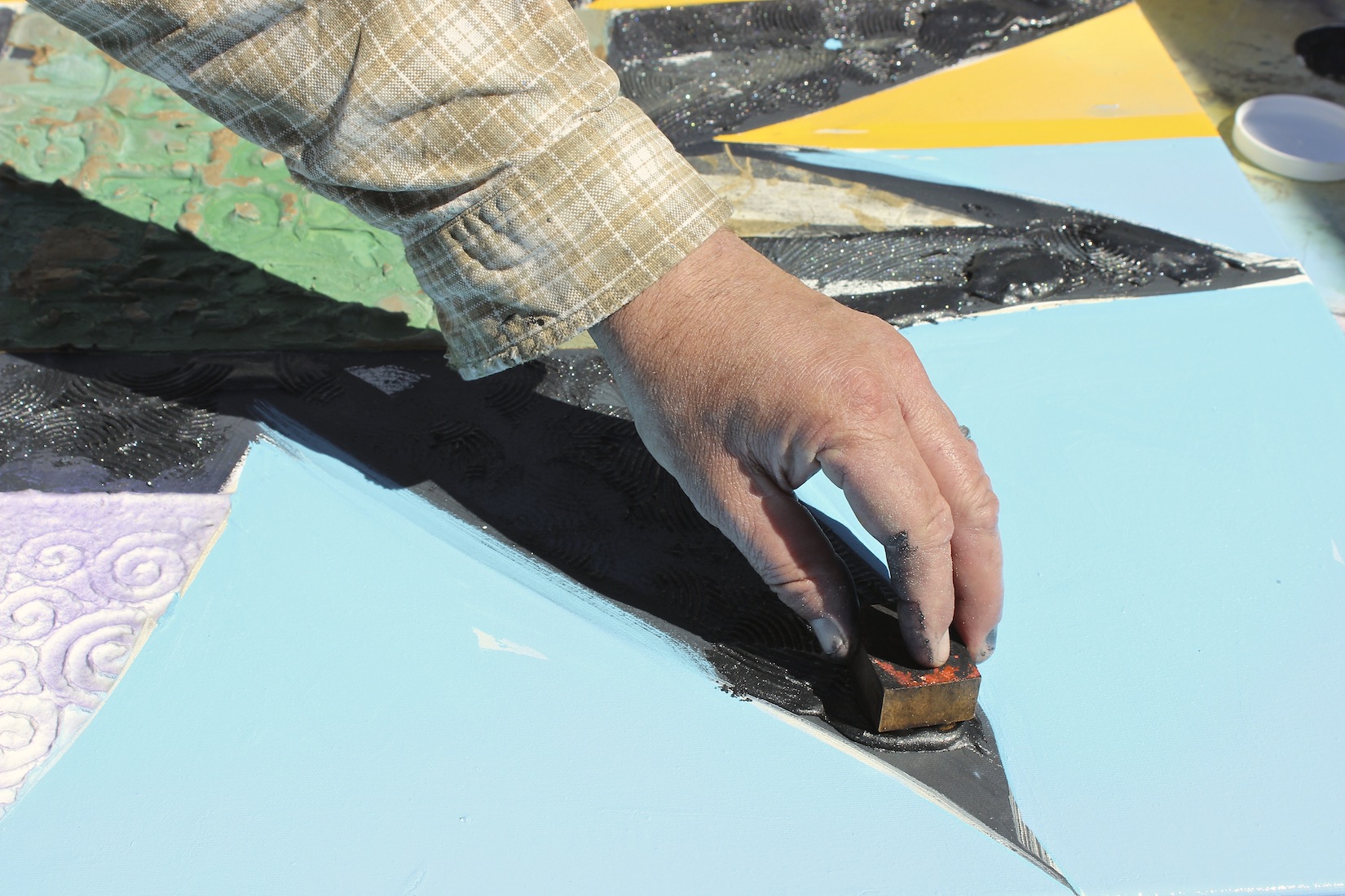
Using a combed pallet knife to scribe textured lines:
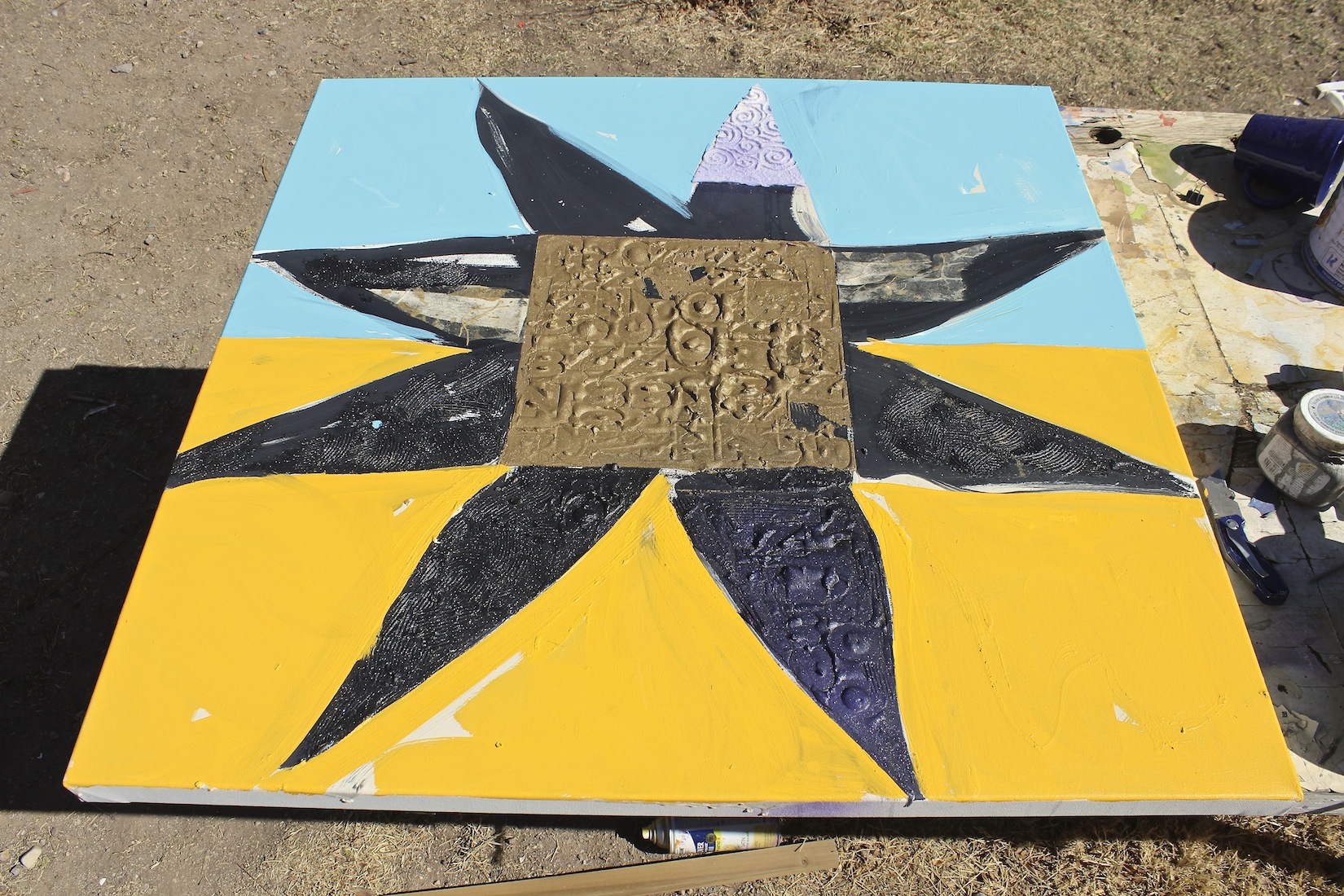
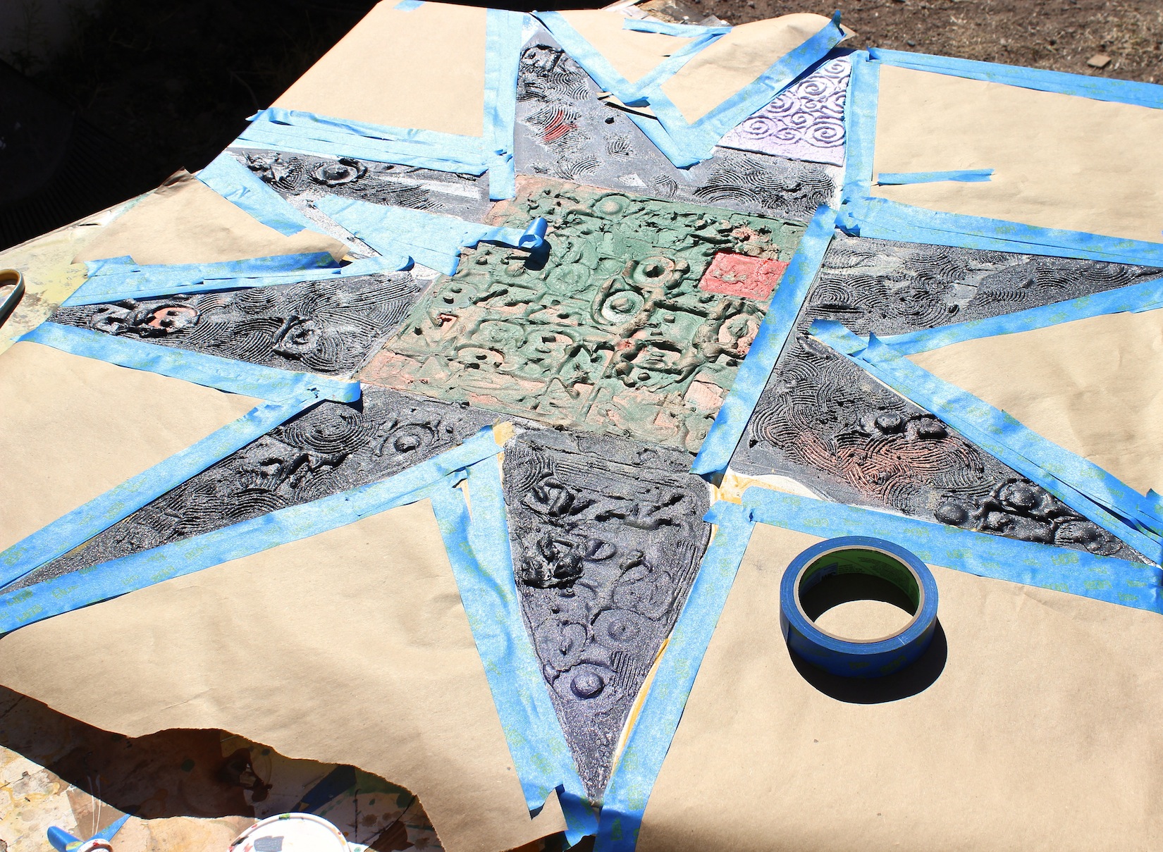
Skipping ahead to masking out the ground with kraft paper and blue masking tape. Note that in the interim I’ve done some spot flooding with metallic acrylic and added a red “seal” to the center area.
Let us spray:

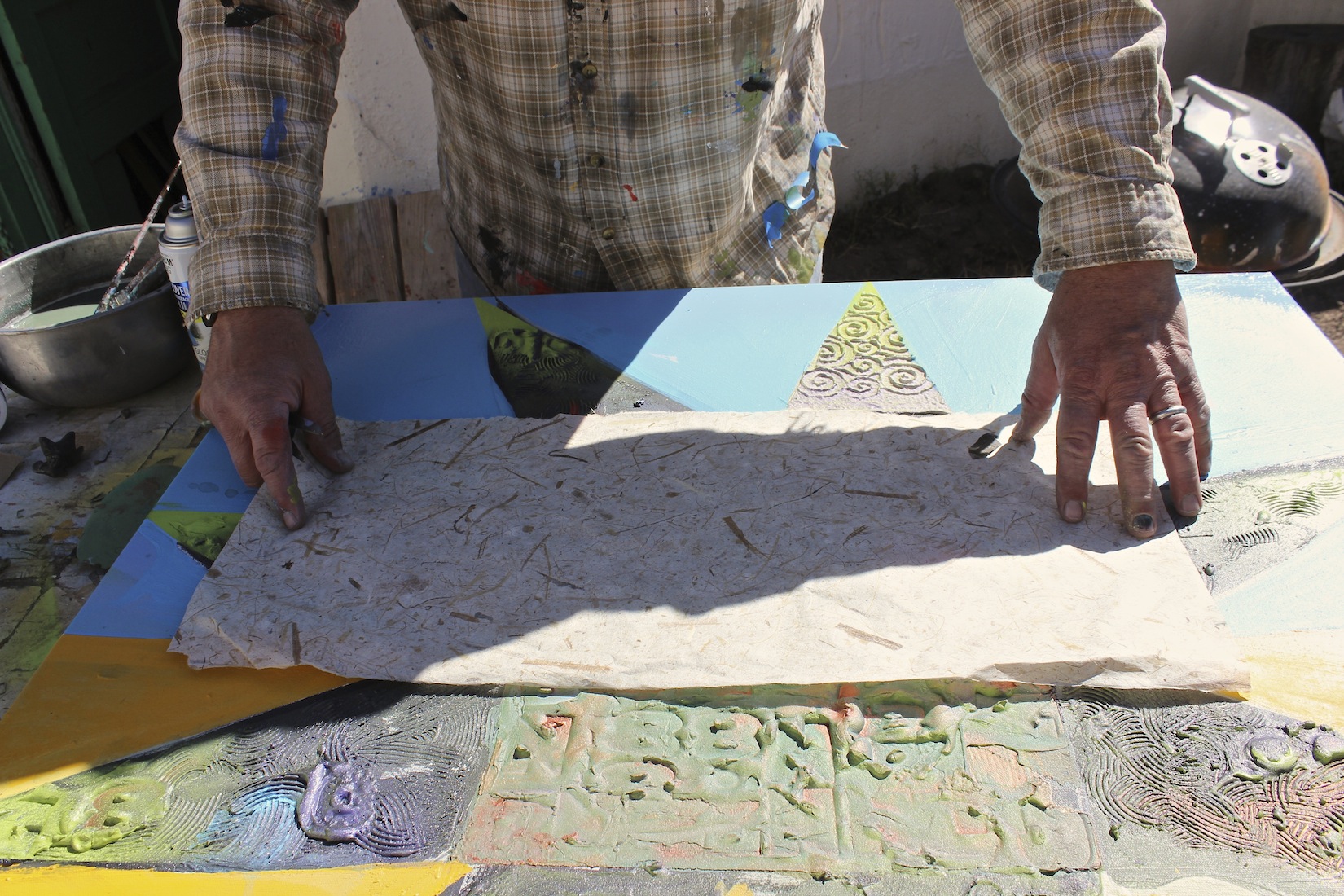
Preparing to add more collage paper. I felt at this stage that I needed to “ground” the form onto the color field. This is a bamboo paper. It is nicely neutral against that bright-colored field and will also be translucent. Present but not dominant. Words to live by:
More collage in place. Green Mango paper added to the bottom ground area. More flooding. Spiral paper up top to “hold” the blue:
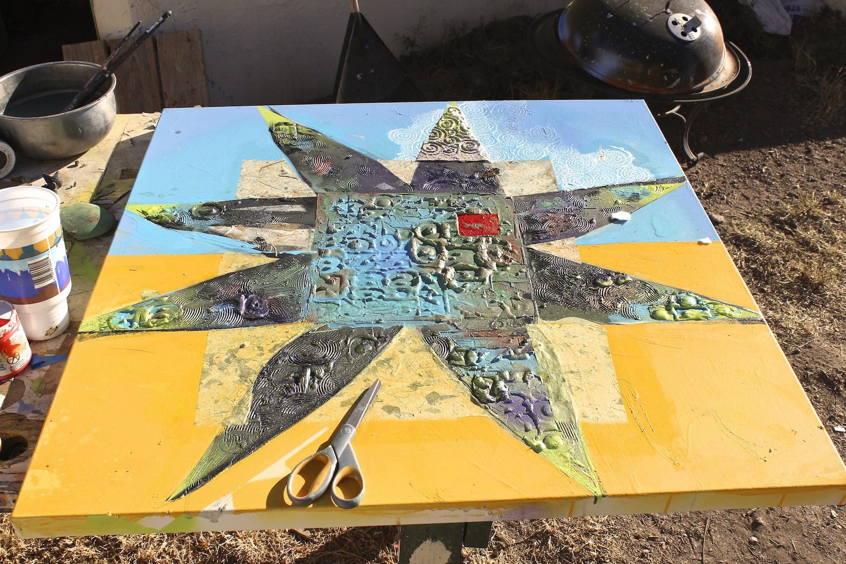
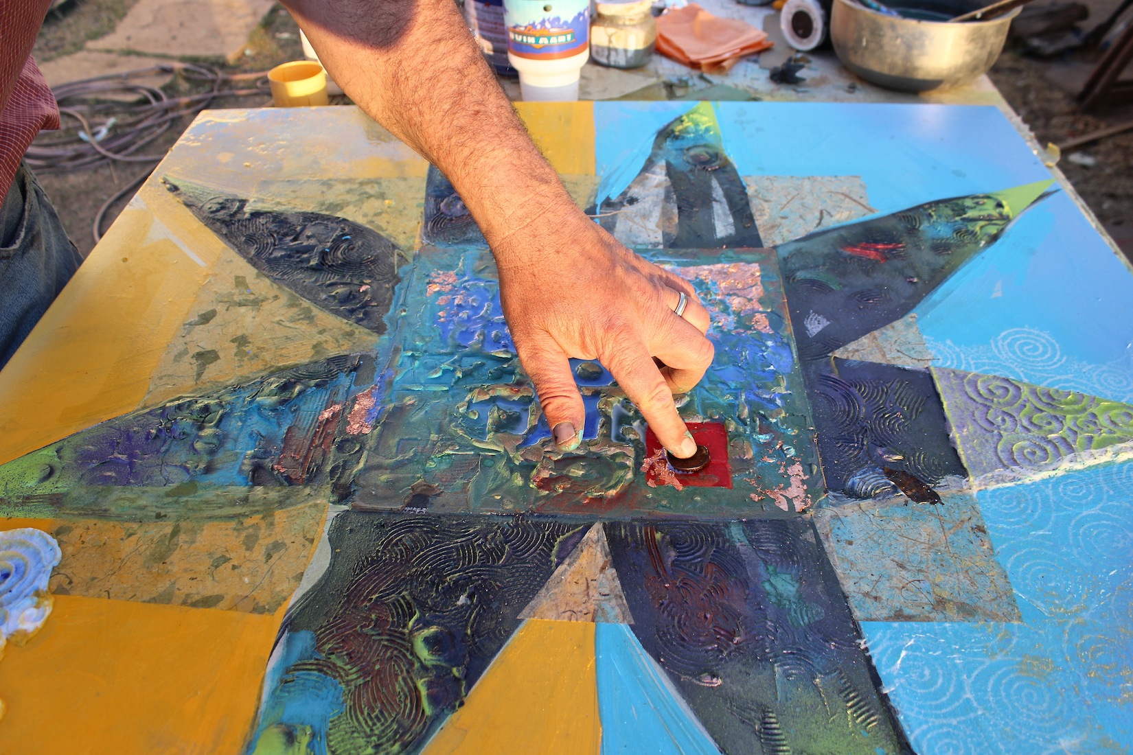
I’ve added “copper” metal leaf to the center. I dropped the leaf onto thinned clear medium. I let one corner square hold and “disintegrated” the rest with a brush. More flooding with Ultra Marine. I’ve placed a rusty bottle cap on the red “seal” area for placement consideration:
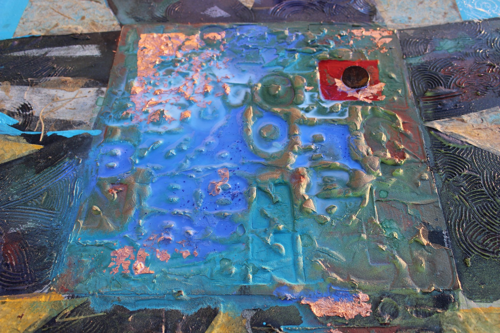
Setting the cap:
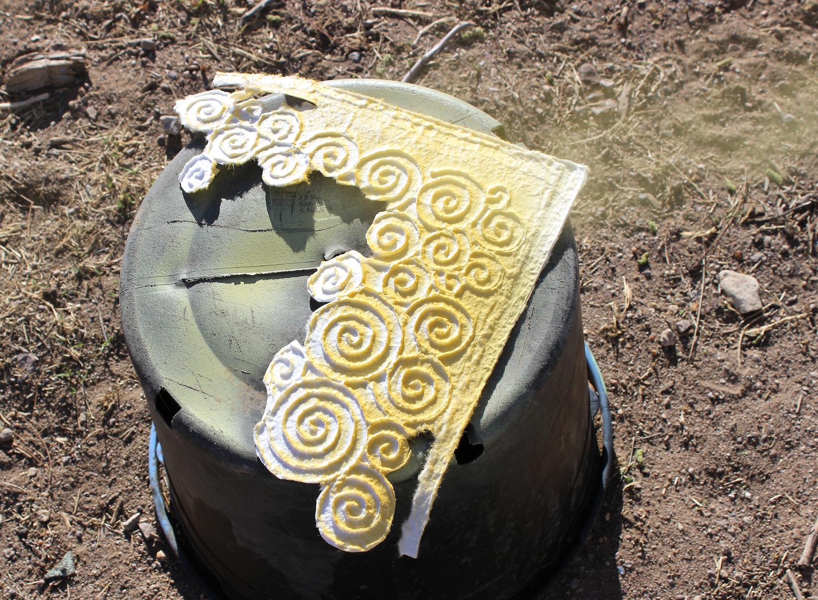
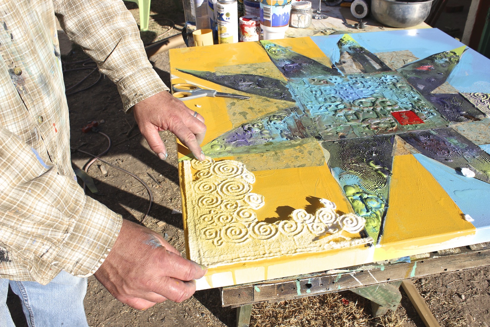
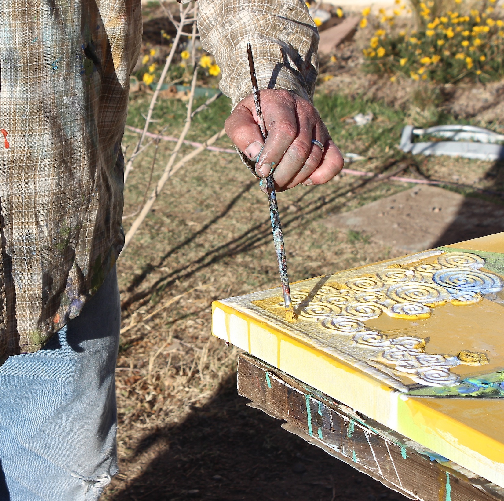
Preparing some spiral textured paper for collaging. You can see some yellow misting off from the right. This color will help ground the collage element, which is a very strong pattern:
There are so many wonderfully patterned papers out there, but they can be overly assertive in a collage context and don’t always play well with others. I tend to use neutrals or lace papers for that reason. Neutrals with inclusions (like mango leaves) and textures will also not fade away over time. If I want color in my paper, I tend to use relatively light-fast paints.
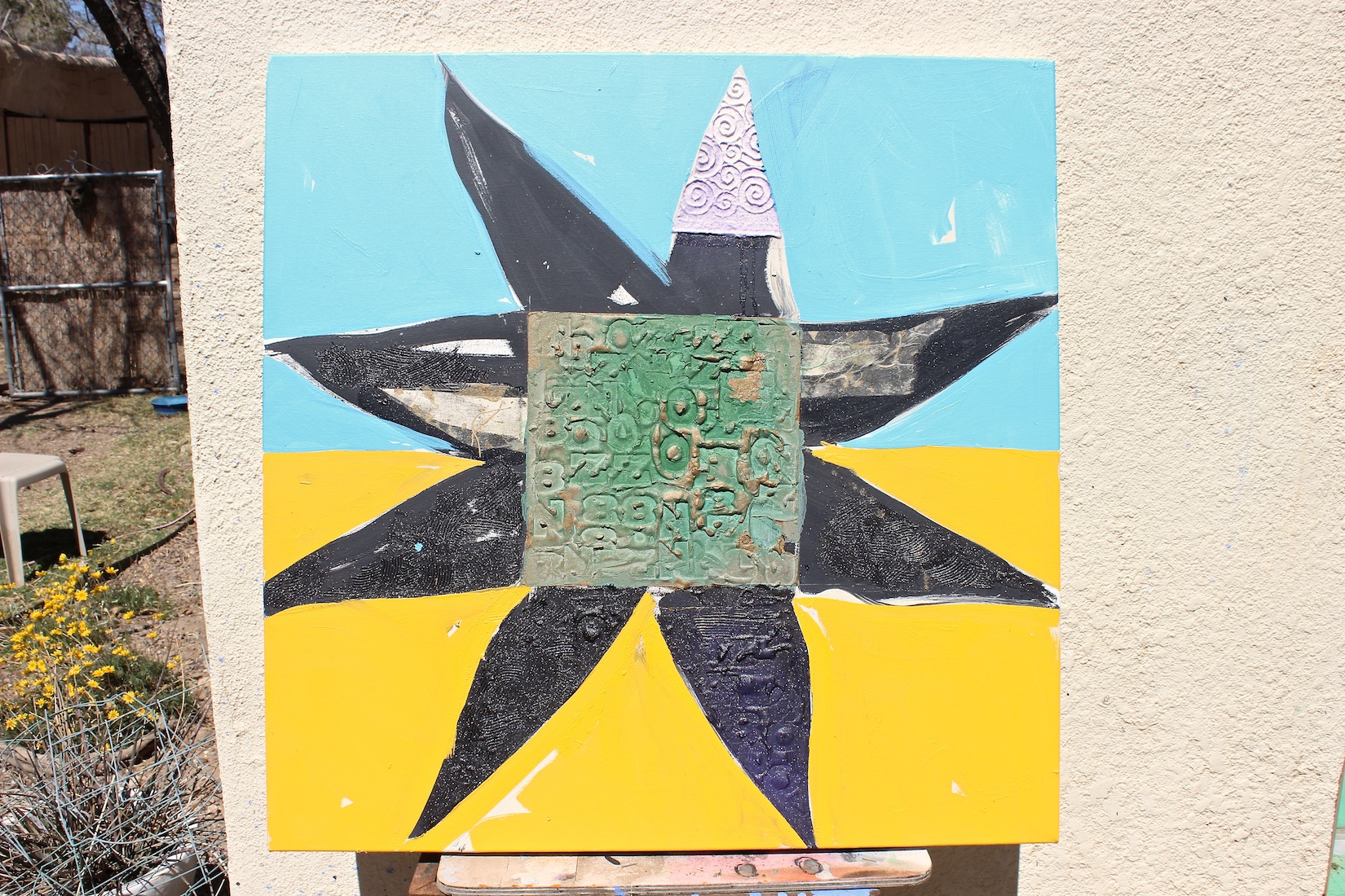
Placing the collage element. This is a strongly assertive texture pattern, but the bold central form can stand up to it, settling into dynamic harmony, don’t you agree?:
Using a little colour to integrate the collage:
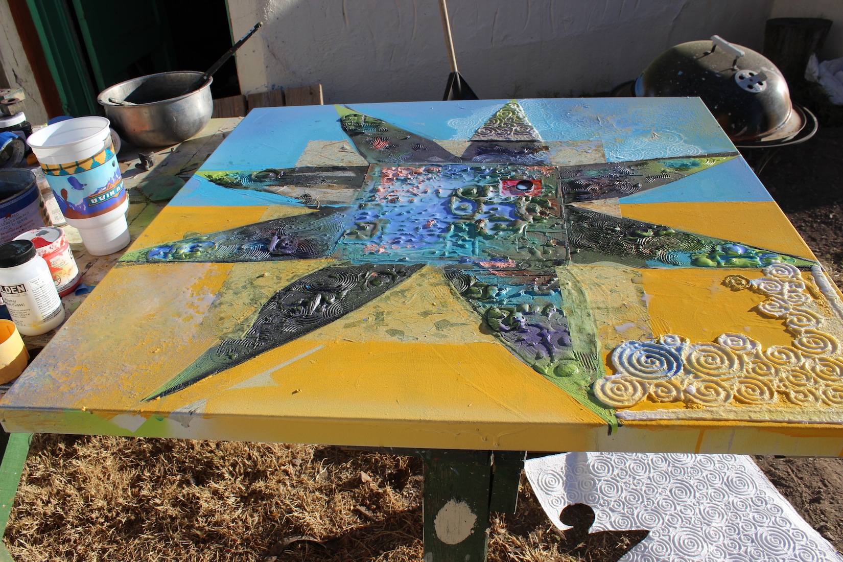
Pause and reflect:
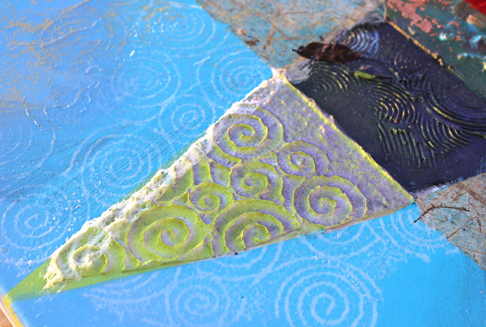
Detail:
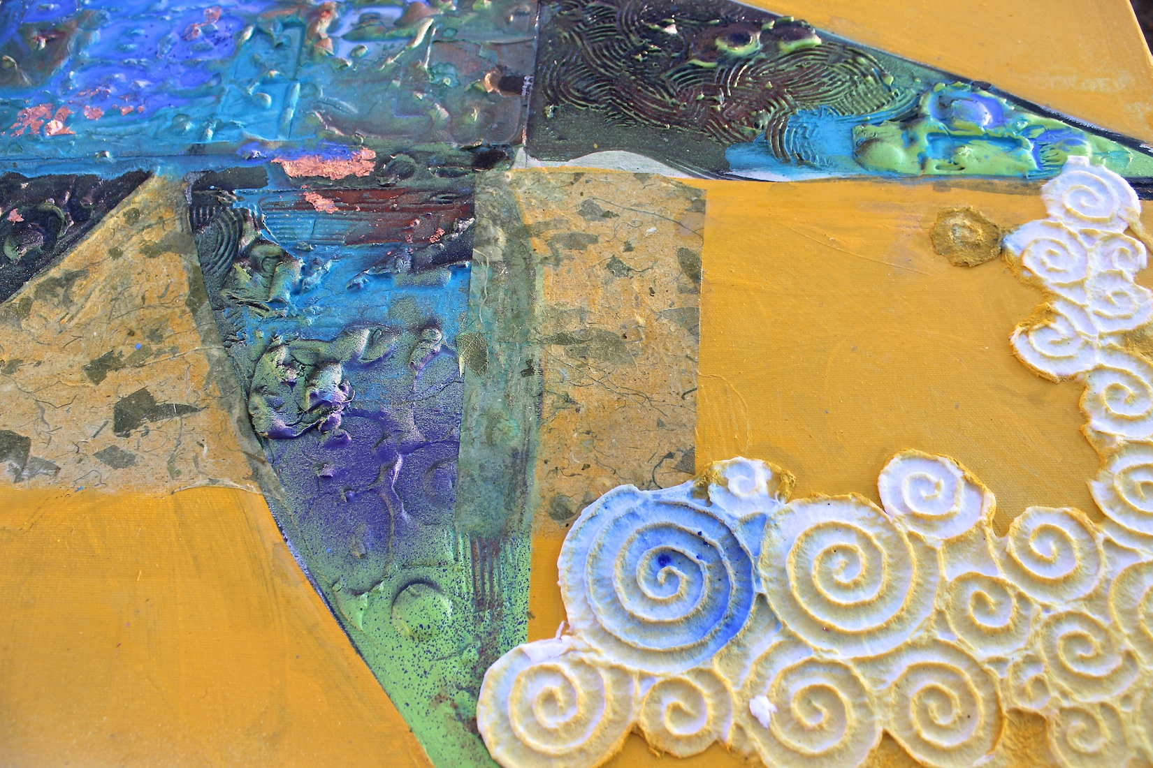
Detail:
I have wet the yellow and blue corner areas with thinned clear medium and misted them with enamel spray. Misted water will break up the surface giving me a mottled, fairly subtle surface:

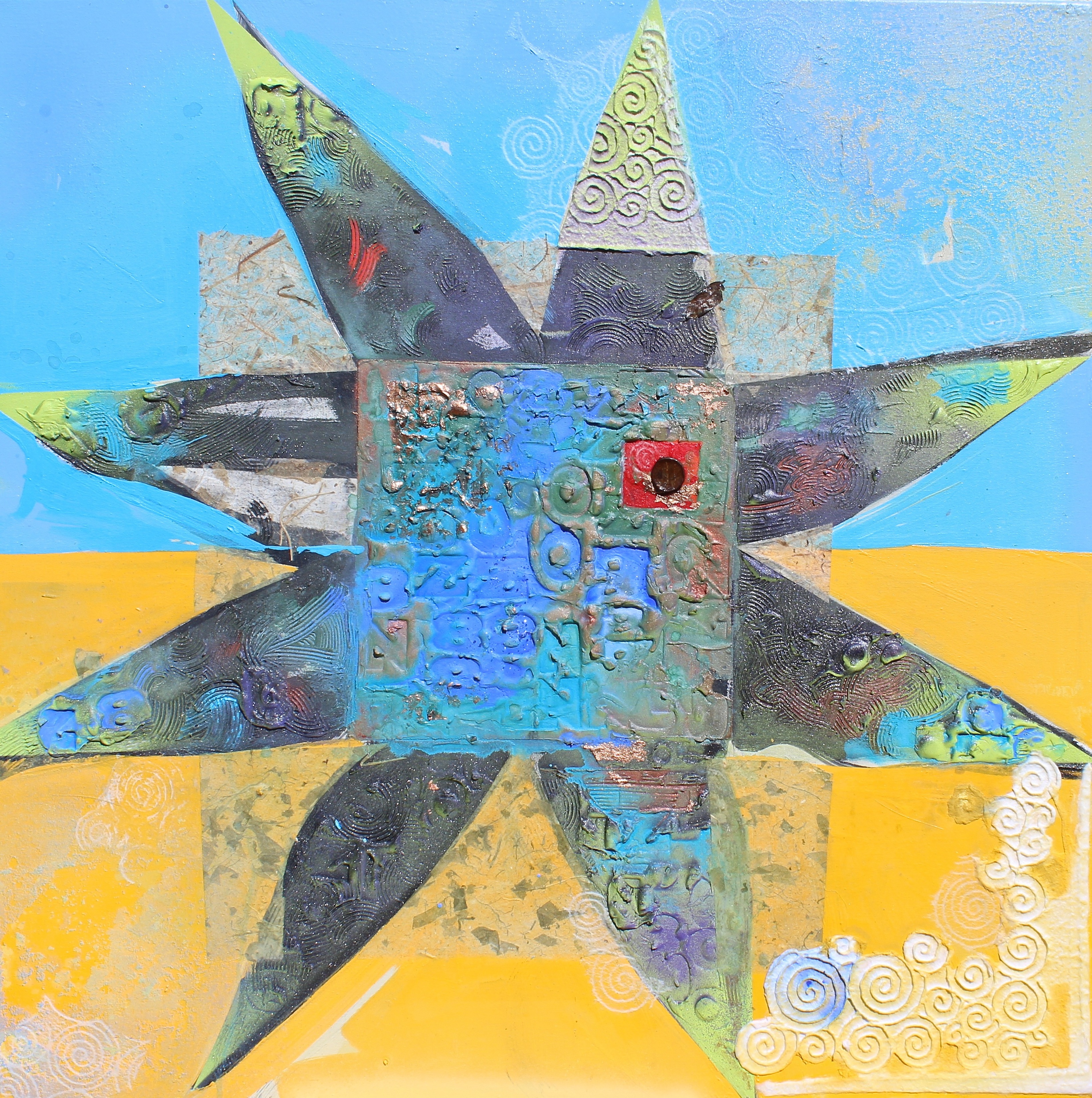
Here she is finished or nearly so. It is a high-resolution image, so click and zoom folks:
Thanks to Heather for taking many of the pix, making lunch, keeping me hydrated, and being an all ’round good sport. Thank you to Studio One assistant Carley and studio assistant-in-training Cody (Little Dude) for their steadfast canine companionship. CC

Carey, I love seeing the whole process of creation! I do believe this is my favorite piece now! Loving your work!
Fascinating process CC.. Very interesting!!
Mmmmmm. That paper, is it the one you bought in Santa Fe that day?
The very very spiral paper! CC